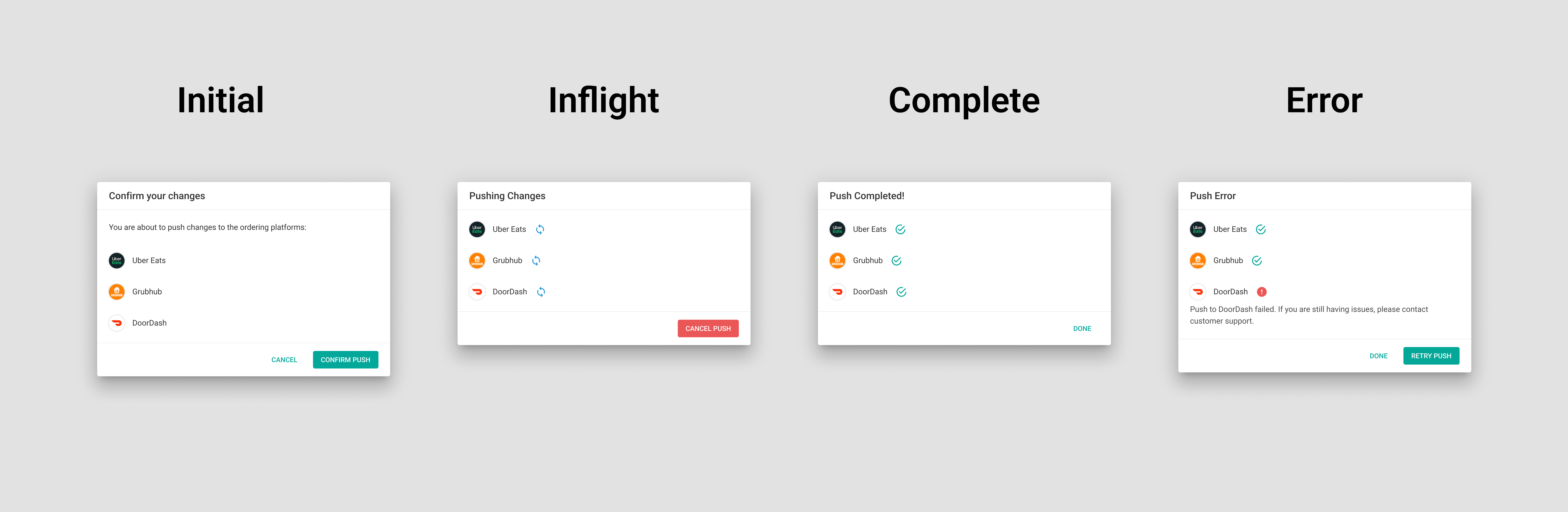
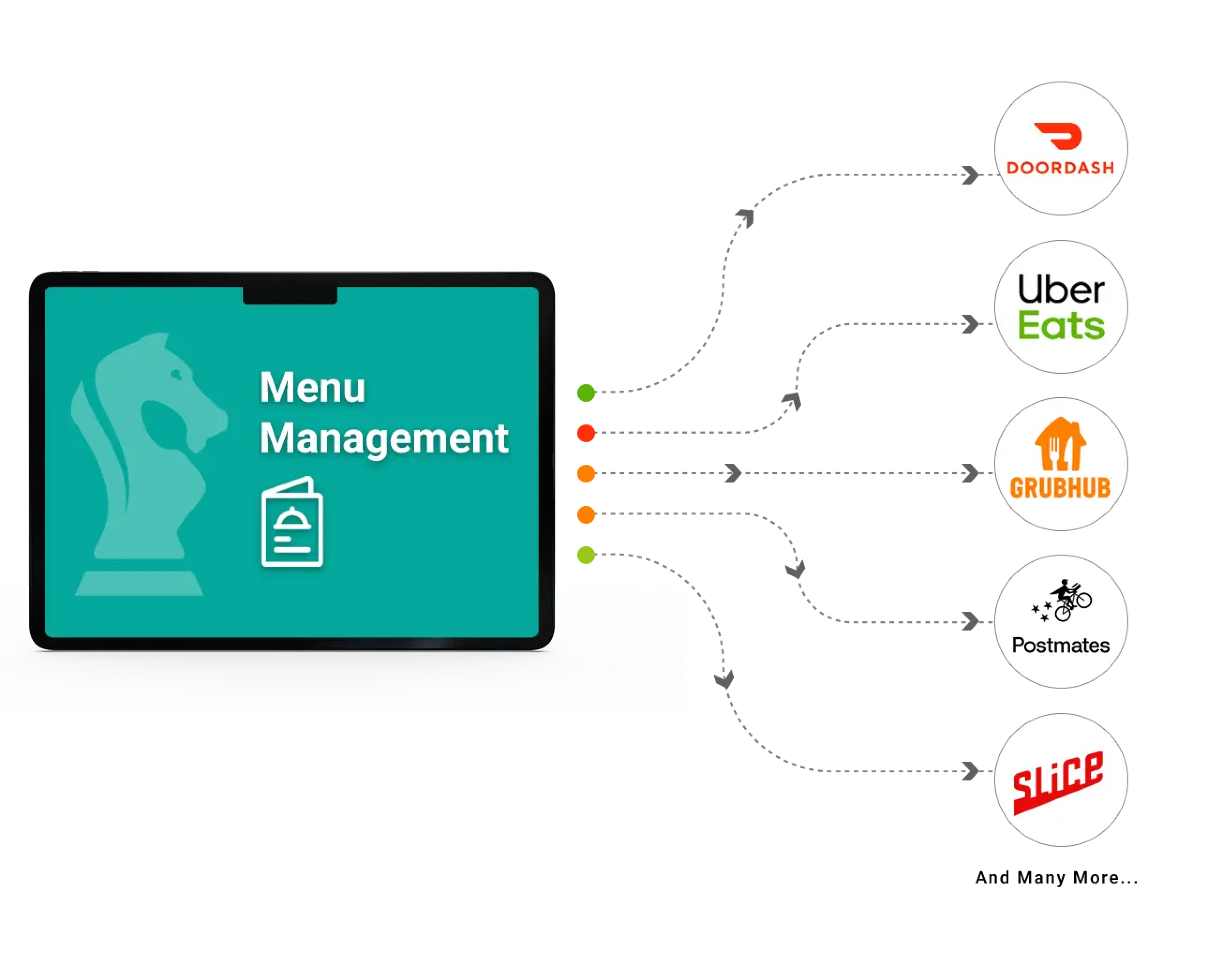
Although ItsaCheckmate core product solved one end of the integration for orders, the next problem is to solve for menus. Restaurant operators were still having pain points trying to update menus on different ordering platforms. Oftentimes, restaurant operators have to log into different ordering platforms to update an item price as an example, and it becomes cumbersome and hard to keep track. Menu Management UI was the solution to one stop shop for managing all the ordering platform menus. Restaurant operators can make any changes to their menu, and push the changes to all their integrated ordering platforms.
Before designing the UI, first I had to understand who were the users and what are their needs. I had the opportunity to collaborate with some Small-Medium Business (SMB) customers, aka "mom and pop". I was able to get direct feedback about their needs and pain points in managing menus on different ordering platforms. From their feedback, I was able to construct user persona that was very important to me when I start on any design project related to the Menu Management UI.
I did some brainstorming sessions, walking through the experience of a restaurant operator, and figuring out what would make their job more efficient when using the Menu Management UI. I thought about how they will log into the portal, navigate through the user interface, and what features they will use to manage the menu.
I did some brainstorming sessions, walking through the experience of a restaurant operator, and figuring out what would make their job more efficient when using the Menu Management UI. I thought about how they will log into the portal, navigate through the user interface, and what features they will use to manage the menu.
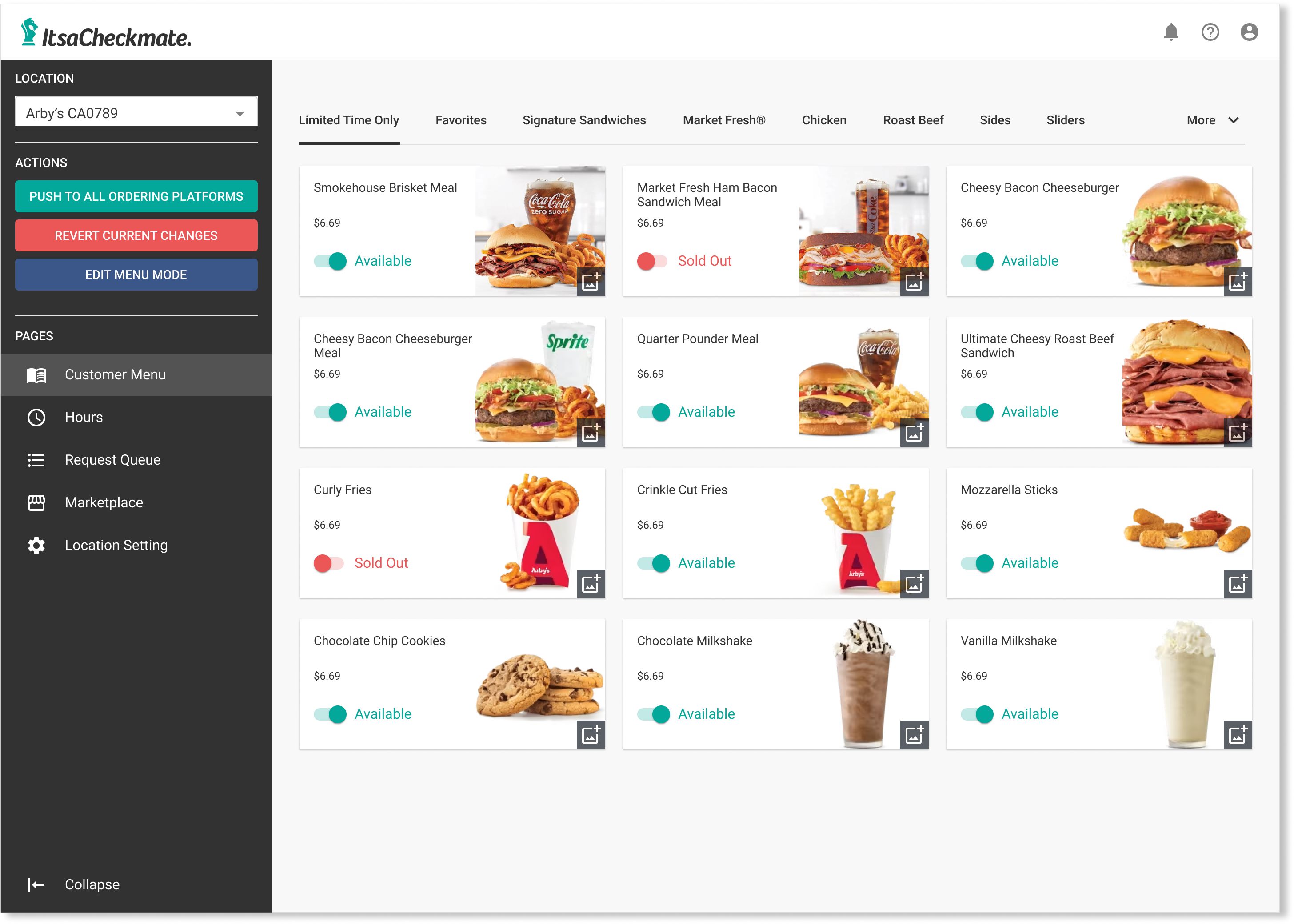
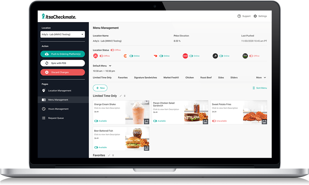
For displaying the restaurant menu, I decided to go with the menu items showing as cards in a grid layout. The item card shows some basic information such as the name of the item, price, and the image. Because marking an item sold out will be the most used feature on Menu Management UI, I decided to add the toggle button on the item card so restaurant operators can see the menu and easily switch an item from “available” to “sold out”.
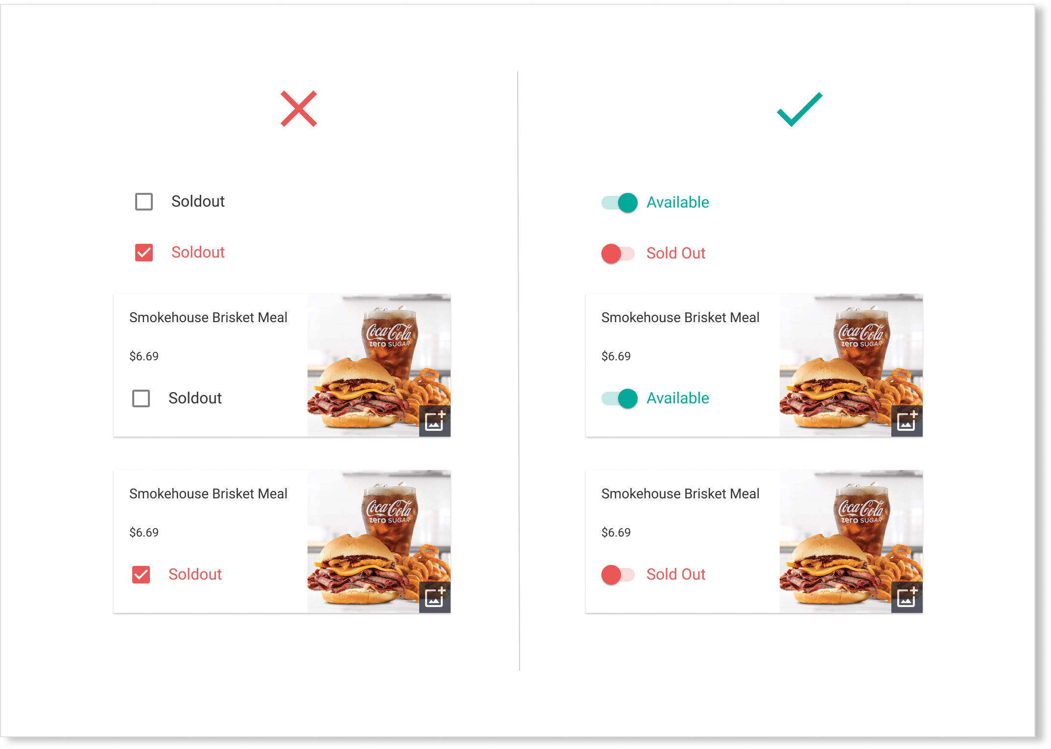
In several design iterations, I explored different UI elements that would create the best user experience for restaurant operators when marking an item sold out. I narrowed the design down to a checkbox and a toggle switch button and did A/B design testing. Based on testing feedback, the user testers found checkbox very confusing and often mistake for an item being sold out. Also, the checkbox represents selecting an option with a purpose that it will be interacted with infrequently. Whereas toggle switch is like a physical light switch that restaurant operators can easily switch an item being “available” or “sold out” on a regular basis. In addition, the visual display of the toggle switch is more clearer with green color that represents an item “available” vs. red color for an item “sold out” and creates more attentiveness so restaurant operators can easily glance at which items are sold out.