Design System / Product Design
A design system for restaurant's Point of Sales - Third Party Delivery Service integration platform
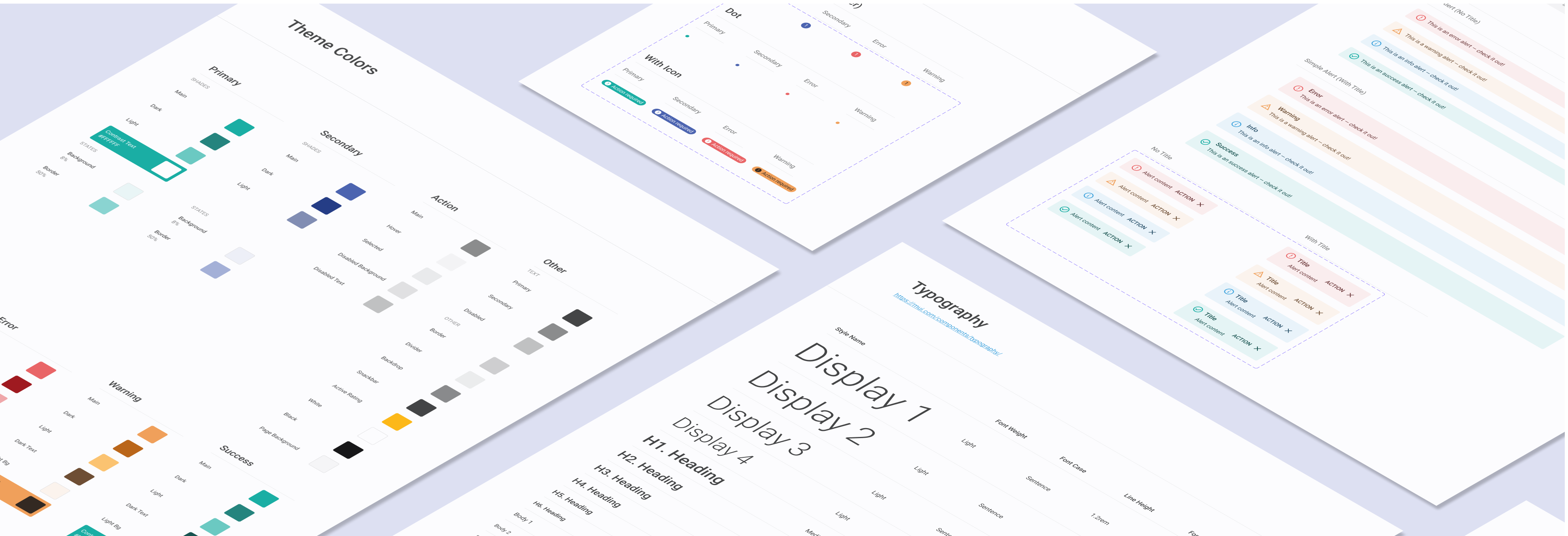
A design system is a collection of reusable components, guided by clear standards, that can be assembled together to build any number of applications, and the need for them go hand in hand with the need for scale, efficiency, and consistency in Design. They basically bring order to chaos. I created the IACM Design System to create that order at ItsaCheckmate. In this project you will see some of the components I built for this design system but a design system is much more then just a component library. If built correctly it is the lifeblood of your products. Take a look at what I put together below.
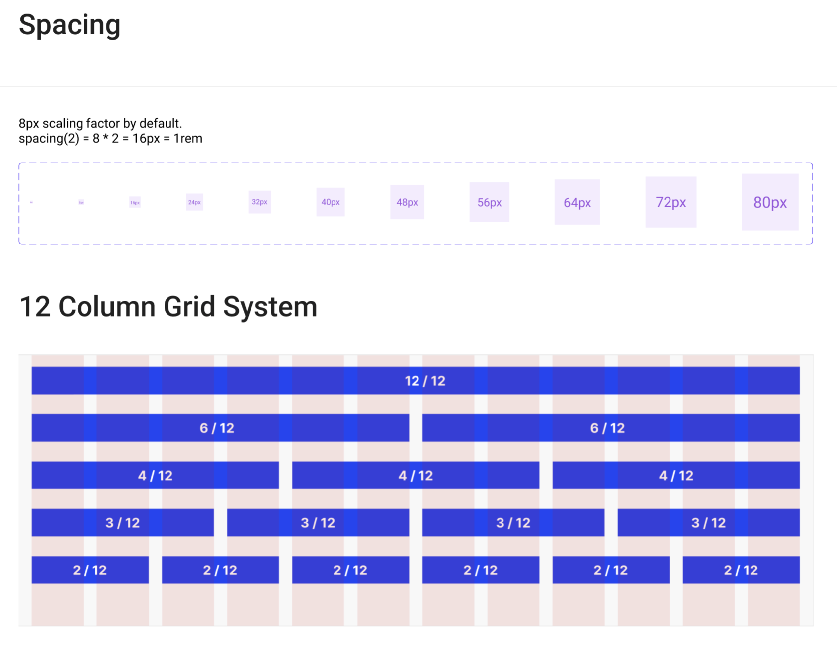
You don't begin constructing a house without first laying its foundation, and the same principle holds true for design systems. However, in this case, the foundation is not made of concrete; it's comprised of your spacing and grid system. Spacing and grids often go unnoticed, yet they wield significant influence over the overall aesthetics of a design. In this particular project, I've chosen to employ an 8-point grid system, consisting of a 12-column grid and an 8-pixel baseline grid.
As for the spacing system, I've opted for a guide based on rems that aligns seamlessly with the 8-pixel grid. My choice of an 8-point system is deliberate, as it enhances the responsiveness of the design system. Notably, all major screen sizes can be evenly divided by 8 along at least one axis, a crucial aspect that helps to minimize anti-aliasing issues. By establishing this robust foundation of spacing and grids, we ensure not only a visually pleasing design but also one that adapts effectively to various screen sizes, ultimately enhancing the user experience.
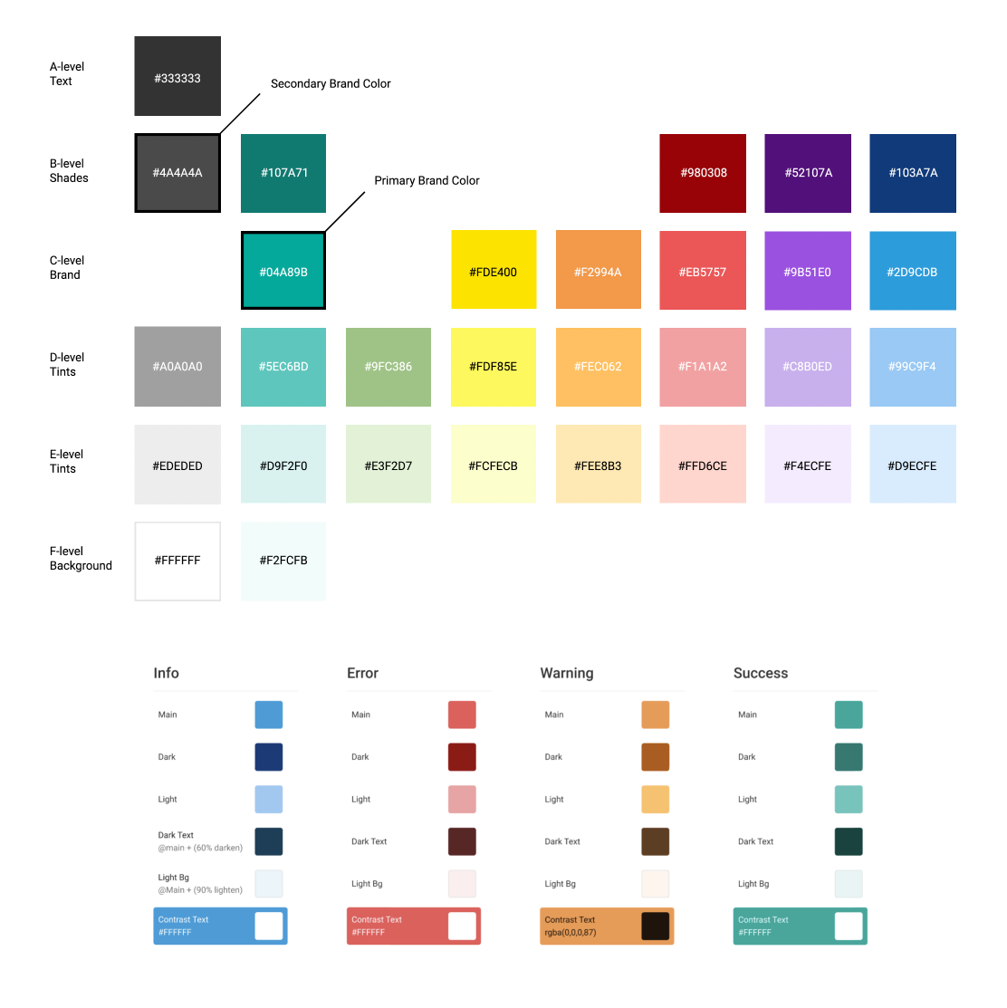
I employ a flexible range of colors that complement the primary turquoise branding without imposing excessive restrictions. We've carefully selected darker variations of the seven core hues to prevent any muddiness within the green, yellow, and orange spectrum.
This spectrum seamlessly translates into our design system, effectively conveying essential concepts such as information hierarchy, interactive states, and the differentiation of various elements. Within IACM Design System framework, each color serves a designated purpose, carrying distinct meanings based on its role within the interface. By clearly defining these color roles, we facilitate convenient adjustments and customization in the future.
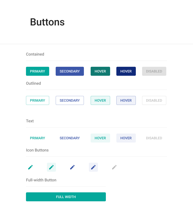
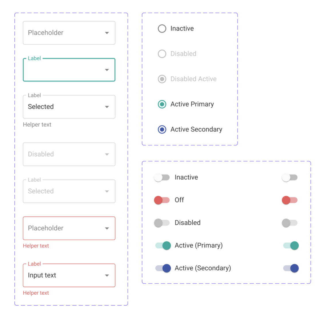
While buttons are a familiar concept to most, it's often overlooked by non-designers that a single button can manifest in various states. The typical states include active, hover, focus, and disabled state. In the development of IACM, I incorporated all four of these states and introduced four distinct button types: Primary, Secondary, Contained, Outlined, Text, and Icon buttons. I've also included option for full-width, which more user-friendly in mobile breakpoint. In Figma, I’ve used the variant feature that helped made the button component more efficient for designers to apply in their work.
Design systems are complex and I've only scratched the surface of components that have been built for IACM up to this point. To round this out I just wanted to show a few of the other components that I've done so far to help IACM serve the ItsaCheckmate brand.